I’ve been a GNOME Shell user for many years now - I’ve started using it pretty much since its initial release in 2011.
I’m using GNU/Linux as my main operating system since 2008, and I started with Ubuntu, as many did back then, and what I liked about Ubuntu was its desktop environment, or DE for short.
Back then Ubuntu was using Gnome 2, a predecessor to GNOME Shell (or Gnome 3), and it was great - very well thought out, customizable, responsible, and lightweight.
However, with the release of Ubuntu 10.10, Canonical moved to their own DE, called Unity, and I found myself in a weird situation.
The Gnome project just announced GNOME Shell, but Ubuntu moved to its own solution.
And both options were, well, how do I put it… buggy?
In my opinion, Unity wasn’t good up until the release of Ubuntu 12.04, and it became really good in 14.04.
Well, at least that’s how I remember it.
I didn’t like Unity so I continued to use Gnome 2 for several years.
GNOME Shell, on the other hand…
Let’s just say that it became really good just recently with the release of GNOME 40.
Up until the release of GNOME 3.28 it wasn’t really that good, there were performance issues, occasional crashes, and other problems.
Combined with the tendency of breaking extensions with every release, and the overall direction Gnome developers took, it wasn’t the best option, again, in my opinion, especially when Unity was making good progress.
But, Canonical decided that Unity isn’t that great, Unity8 wasn’t making good progress, and with the release of Ubuntu 17.10, they’ve moved to GNOME Shell too.
However, they’ve used gnome 3.26 and it wasn’t particularly great at the time, as I’ve mentioned it.
Now, you may wonder - why I’m only talking about Ubuntu?
There were, of course, other distributions that used Gnome at the time, it’s just I used Ubuntu back then so that’s what I remember personally.
I’m no longer an Ubuntu user though, I’ve moved to Fedora, simply because it has a vanilla Gnome, without any stupid things put on top of it by the developers of the distribution, like extra extensions or themes.
Yes, I prefer Gnome as is - default Adwaita theme, no extensions that change the UI, like docks.
But there’s still one problem that I think is somewhat serious, and it is a common problem with a lot of interfaces today.
And I noticed this problem when Ubuntu changed to Gnome in the 17.10 release.
You see, Unity was made to be something in between - something more modern than Gnome 2, yet not as modern as Gnome 3.
When Gnome 3 was released in 2011 it was looking rather different from Gnome 2.
Unity, on the other hand, kept the good things of Gnome 2, yet expanded on some usability features, like good support for the global menu and HUD.
The in-app menu search in Unity was amazing, but I’m going away from the topic.
What’s common between most modern interfaces as of today?
They’re all big.
And so was Gnome, already in the year 2011 going way ahead of its time.
Mobile-oriented UI
With the increased popularity of mobile devices, there also was the rise of mobile-oriented designs.
Web pages now have a dedicated mobile-friendly mode, where all elements are bigger, so it is more comfortable to navigate with a bare finger, which provides far lower precision than a mouse pointer.
Mobile apps use similar designs to web pages, even to the extent that some mobile apps are made with web technologies, and some web pages can be installed as an app.
A tablet is another quite popular device type, quite similar to a smartphone but bigger and more aimed at surfing the web.
However, even though it usually has a bigger screen, it is still used with fingers as the main input device, so the UI elements are still big so users could reliably navigate them.
Desktops, however, don’t suffer from this, as they have a touchpad/trackpoint/trackball/mouse to control the pointer with great precision, and rarely have a touch screen, though the latter became more popular lately.
But the popularity of mobile devices impacted the desktop UI guidelines as well.
The first victims were desktop versions of the mobile-first web pages - they were either just stretched-up mobile versions or desktop variants that were stylized after their mobile versions.
And it started to creep into the desktop UI itself.
And Gnome and macOS are affected by it the most.
If you’re a Mac user, you know that visually macOS gets closer and closer to the iPad OS with each release.
Perhaps that’s because they want to unify the operating systems, and make the iPad a fully featured portable computer at some point, similar to Microsoft Surface.
Maybe, it’s just my guess - I’m not an Apple user and won’t likely be one.
But what this means is that UI elements are getting bigger and more spaced out, in order to be usable on both desktop and portable devices with touch screens.
There’s a great post by Andrew Denty, which has a lot of images, comparing Catalina and Big Sur versions of macOS.
Here’s one of the images from that post:
Figure 1: macOS Catalina on the left, Big Sur on the right
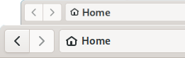
If you look at the window headerbar, you’ll notice that it is almost twice as big, as it was before.
Well, not twice, but about ~1.4x bigger - the old one is 76px tall, and the new one is 106px:
Yet the close, minimize and maximize buttons size remains the same.
Other elements also have bigger padding, making the UI more spacy.
I guess it is considered beautiful, but I also think that this is a waste of screen space.
Macs are unlikely to get touch screens any time soon, and even if they are, the increased height of the headerbar won’t make a difference for the user, who’s trying to touch the minimize button right next to the close button.
So I don’t think it was a change needed to make macOS closer to having the touch-ready interface, but a pure stylistic one.
But, well, the post title was about Gnome, and here we are, talking about macOS - why?
Well, because Gnome takes a lot of inspiration from macOS, as far as I can see, at least.
See for yourself:
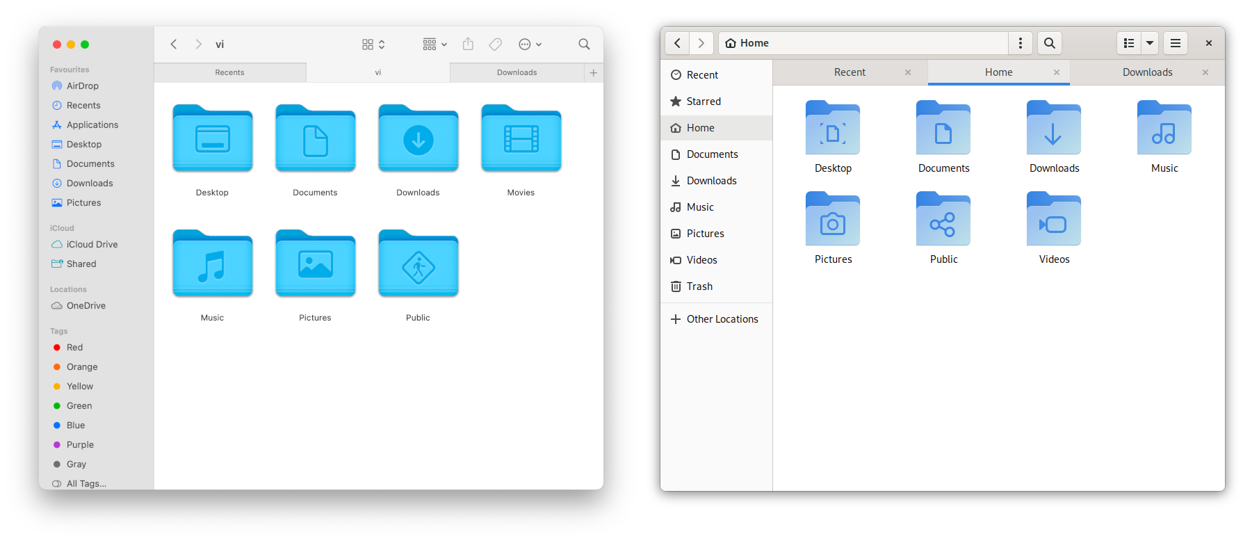
Figure 2: macOS Finder and Gnome File Manager
Yeah, yeah, I know, a Mac user will say that it’s not even close, but the inspiration is pretty clear to me.
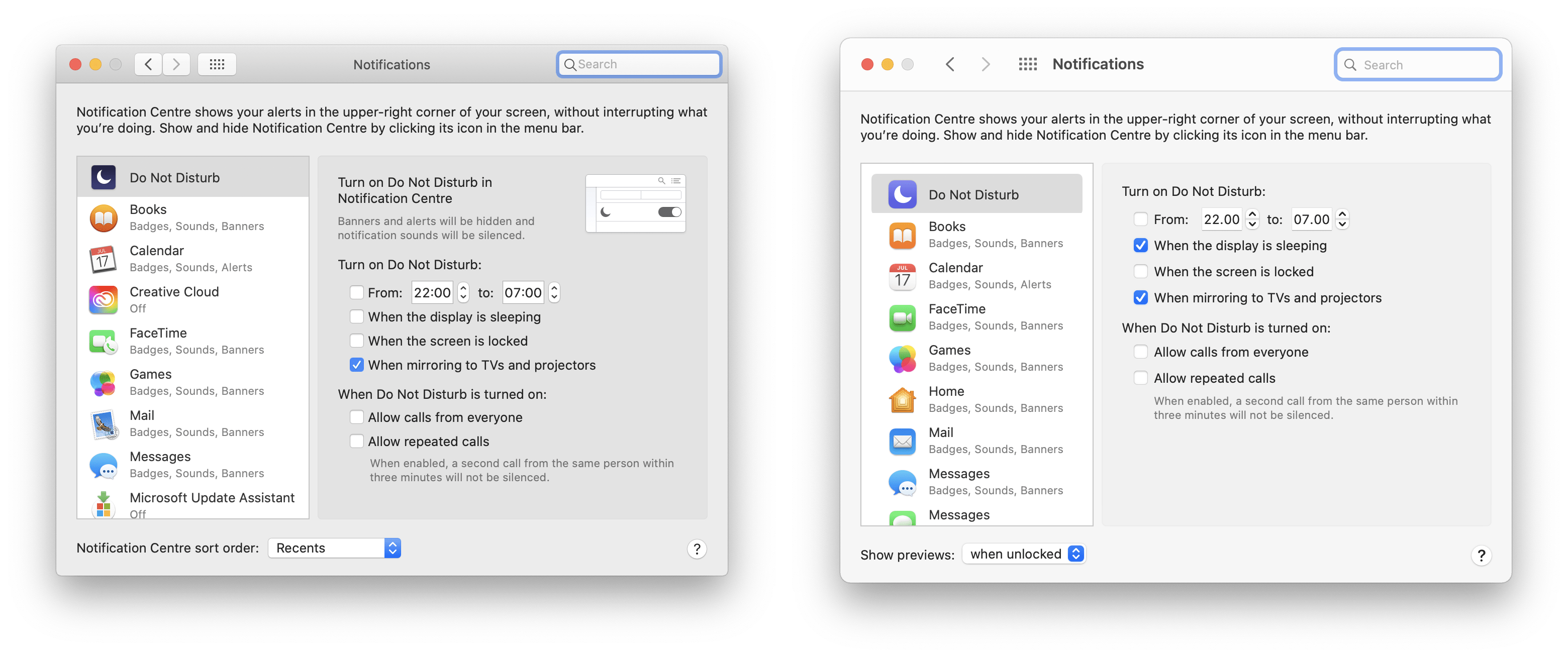
Nikitonsky even used Gnome’s settings app screenshot as a joke after a long thread on the redesign of the settings window in the macOS Ventura beta version:
Well, enough with the comparison to macOS, let’s get back to the main topic.
Mobile-oriented desktop UI?..
Yeah, you’ve read that right - Gnome wants to be on mobile phones and on the desktop at the same time.
Their UI is designed with this idea in mind.
A lot of apps change layout when you resize the window to be more like a screen of the phone:
This is a nice touch indeed, and I can appreciate the effort, especially since there are ways to run Gnome on mobile phones today.
Alternatives are always good and given the sad state of Android as an operating system, I’m all for full-blown Linux on mobile devices, with nice-looking native apps.
And while this is cool and all, here’s a big problem:
Gnome interface elements are just way too big on the desktop.
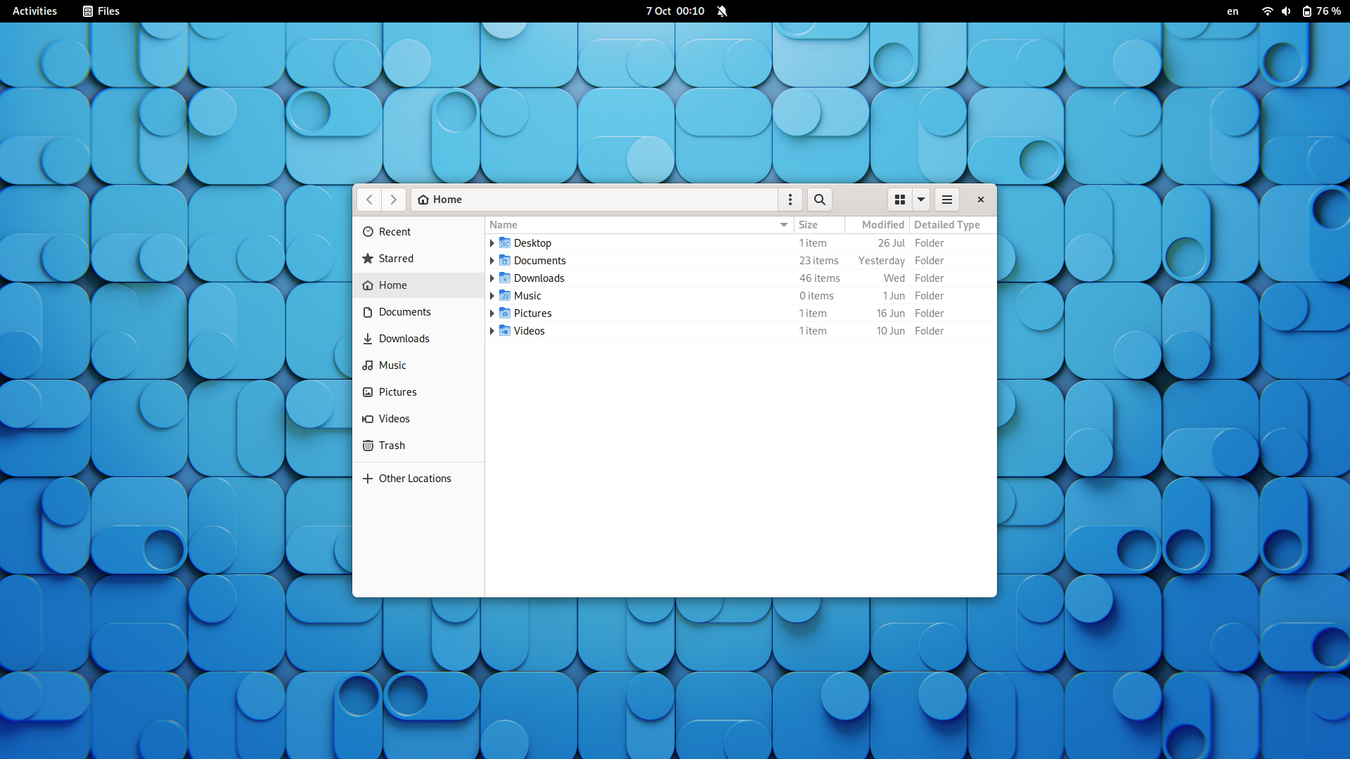
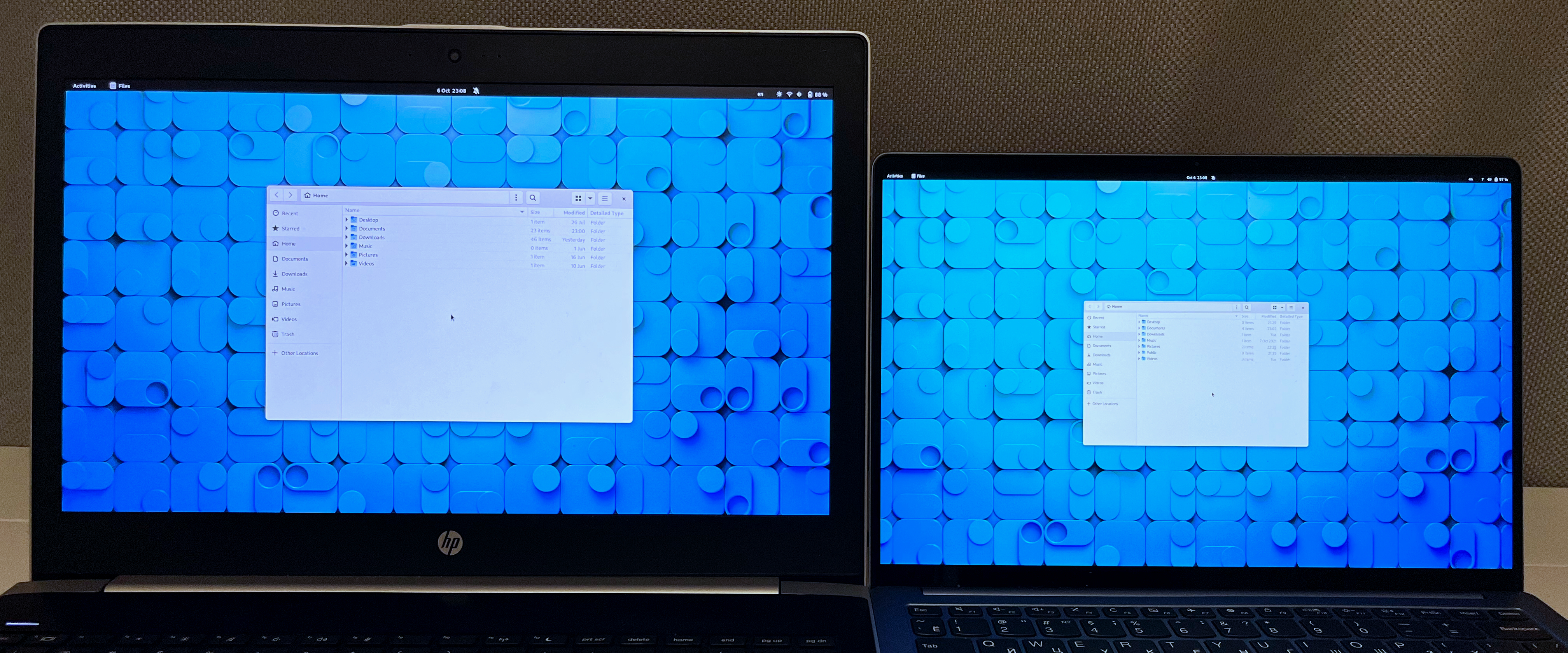
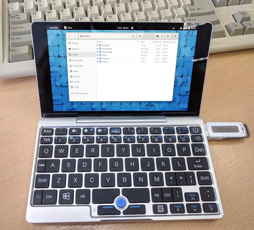
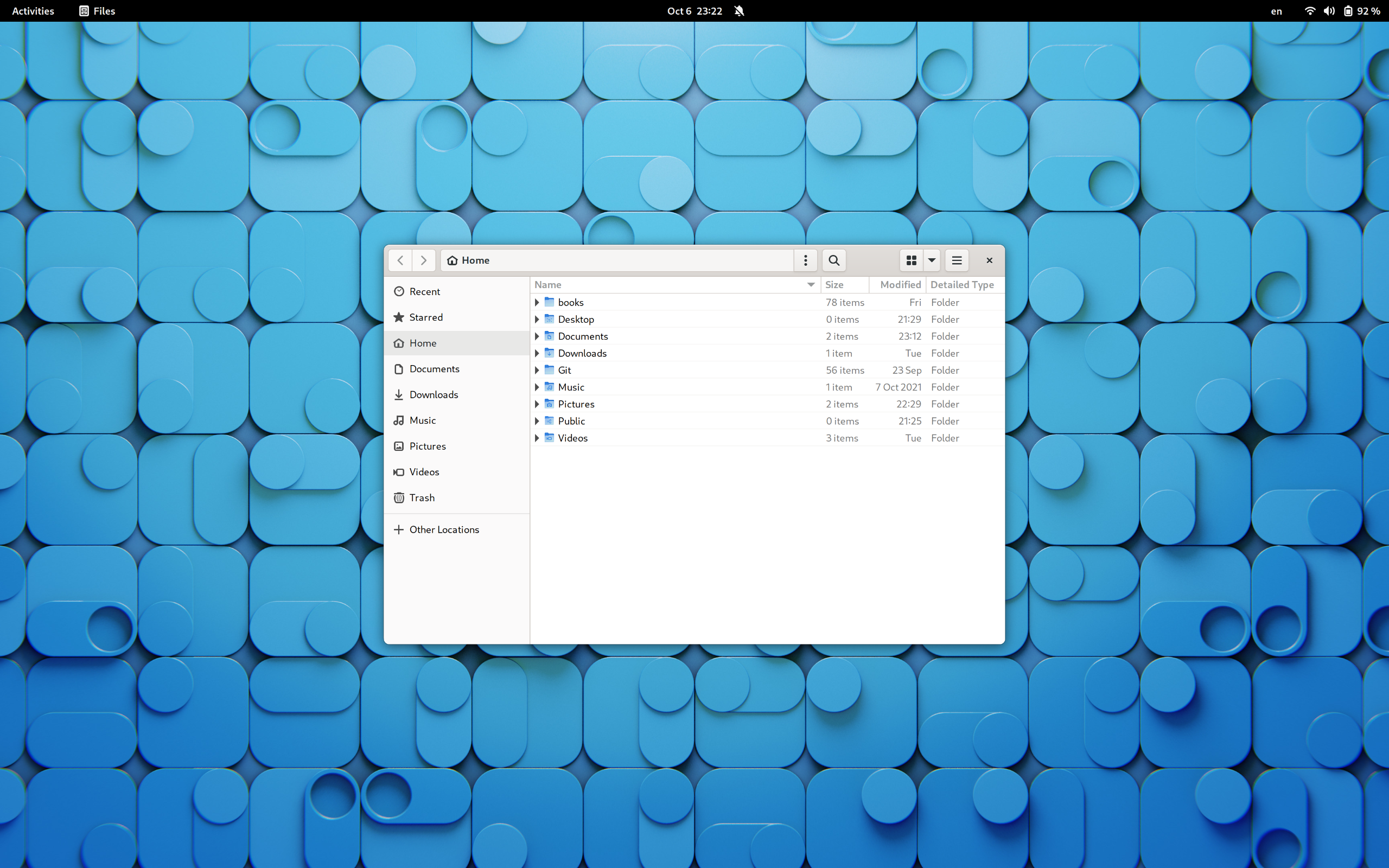
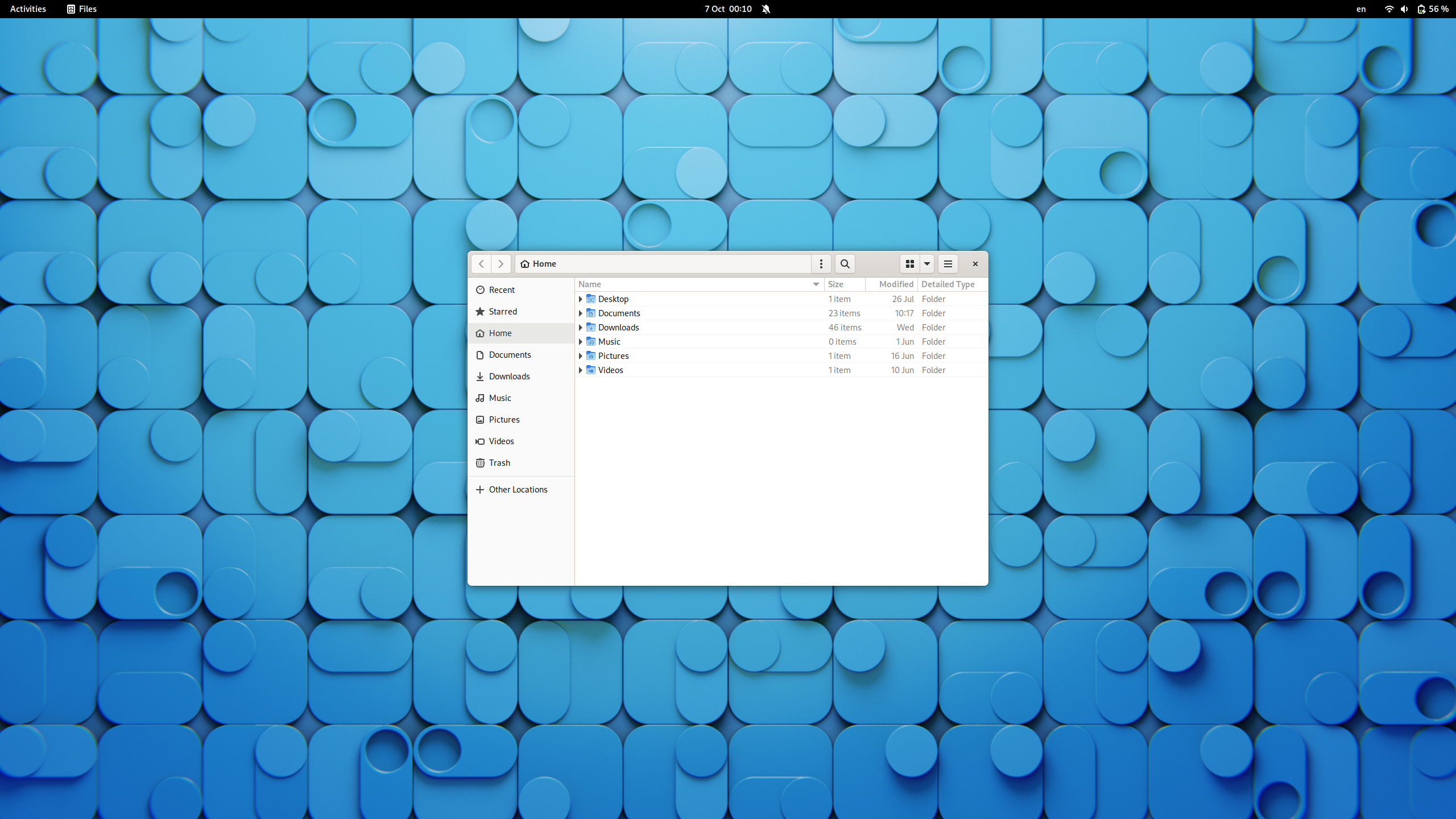
Here’s a screenshot of the Gnome desktop on a Full HD display:
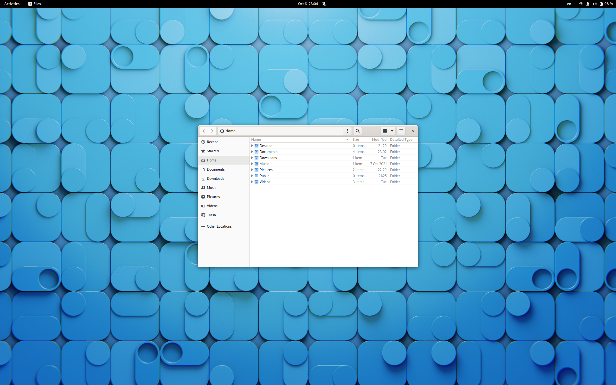
And here’s a similar screenshot but on a 2K display:
Just by visual comparison, you can see how much more space the file manager window is using on the first screenshot.
Note, however, that both screenshots have file manager windows of the very same size, e.g. there’s no interface scaling.
If you have a 1920×1080 display, try opening both screenshots in full screen, to see how the UI scale changes with the resolution.
I, unfortunately, don’t have two displays with the same diagonal size but different resolutions, but here’s how it looks on my two laptops, from which I’ve taken the screenshots.
Edit: After getting a few comments on the fact that comparison screenshots don’t show anything useful, as the file manager windows have the same pixel size, I understood that I was not quite exact on what I wanted people to see.
The problem in my explanation was with the fact that while windows do have the same size, the text size was supposed to be different but I forgot to enable it.
Sorry for the confusion, and thanks for pointing this out.
I’ve enabled font scaling and re-made the screenshots, so I hope that now this will illustrate my point a bit better.
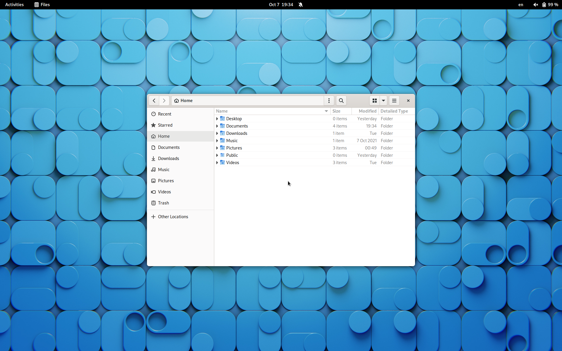
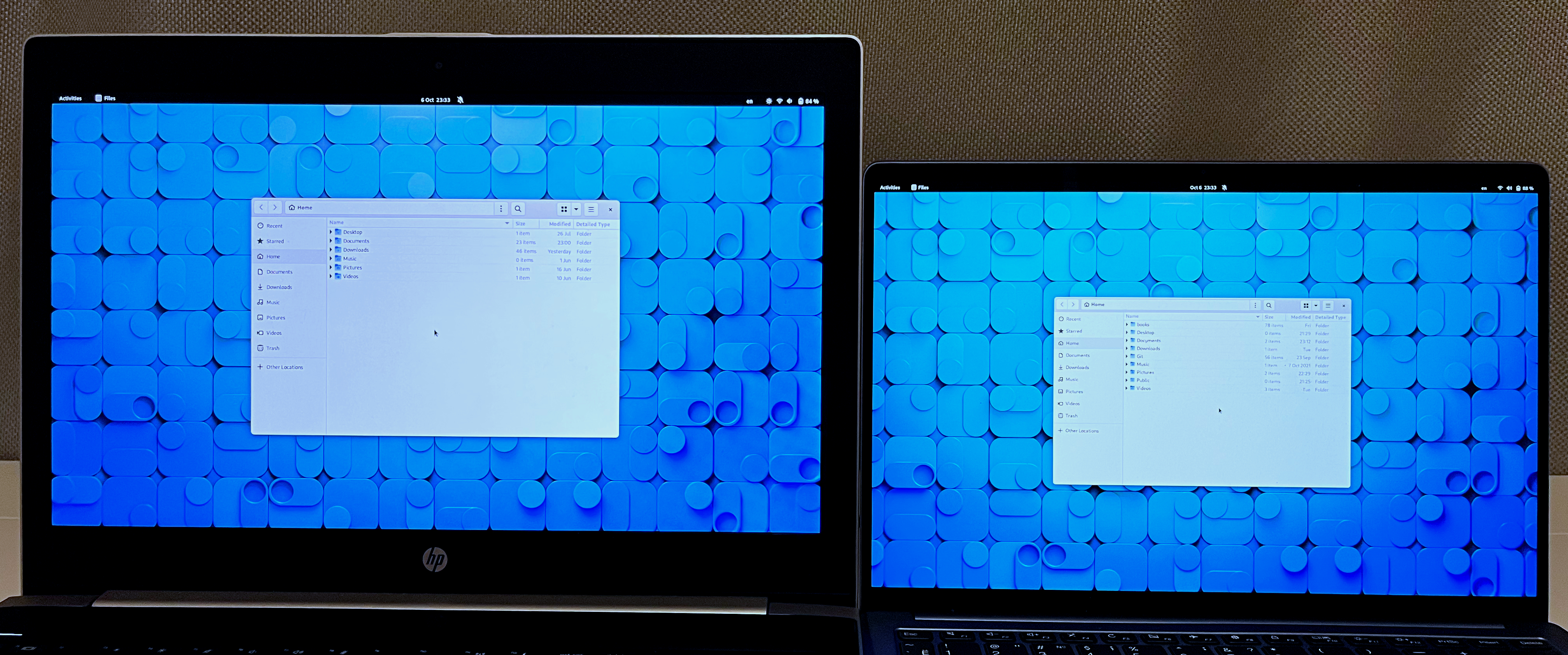
Here’s a screenshot of a display with a resolution of 1920×1200:
This is how I see things on my work laptop, which has no UI or font scaling
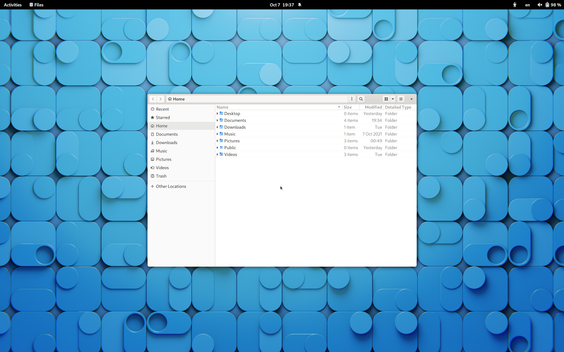
Now the same image, but I’ve downscaled 2560×1600 to 1920×1200 and upscaled fonts to 1.33x.
This way the images will have the same size, but you’ll see the difference in the UI element sizes:
You can toggle between these screenshots to see the difference in UI scale.
I, naturally, see it on screen, given that I use the latter setup on my smaller laptop, and the first screenshot represents the setup on my work laptop.
And I indeed had to adjust the size of the file manager window so their geometry matched, however, note that the text size is the same1 on both screenshots:
Figure 6: UI elements are scaled down, yet the text is the same size
I understand that this was not very obvious to see from the screenshots I provided earlier, that’s why I’ve included laptop photos that should have demonstrated this idea.
Hopefully, these screenshots better illustrate my point.
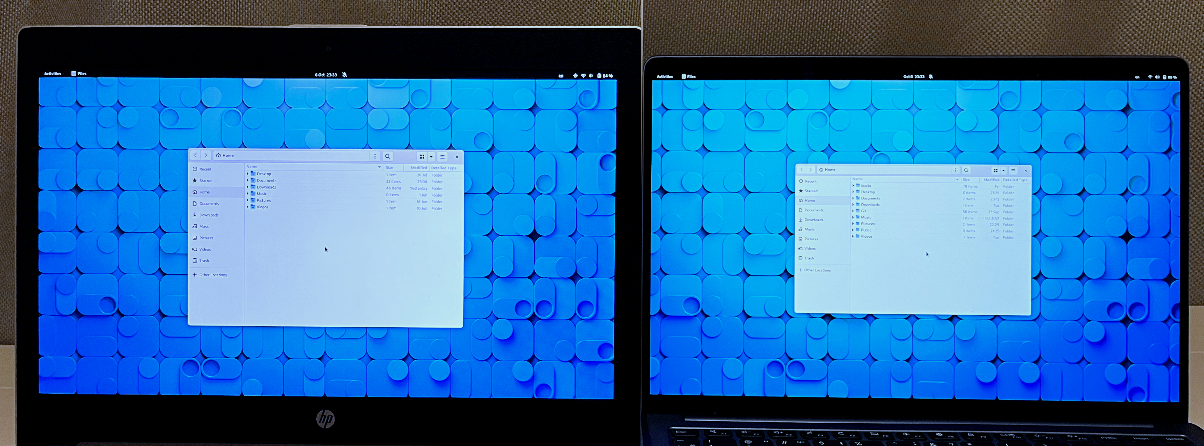
The first one has a 15-inch Full HD display, the second one has a 13-inch 2K display:
Now, let’s set the screen scale on the 13-inch laptop to 125% and compare:
It may seem that apps don’t have the same size, but that’s due to the fact that the screens have different heights, and actually, 125% scaling matches how the screen would look if I had a 2k 15-inch display, instead of a 13-inch one.
Here’s a better illustration:
I’ve used my GIMP skills to increase the height of the second display to match the height of the first display.
You can see that the file manager windows are indeed (almost) the same size.
Well, I guess I could just add a screenshot with the system scale set to 125% but the post already has way too many images, so if you want to compare them, see the footnotes section 2, 3, 4.
So what do I want you to take away from all of this?
I’m using the laptop on the left for 9 hours a day because it’s my work laptop.
And each day I do I feel that the interface could have been 25% smaller.
Notably, I felt this way even before I got myself a laptop with a higher resolution - and when I did I realized that Gnome works perfectly with this kind of pixel density.
I’m using the right laptop right before and after work.
This is basically my hobby machine - I write this blog on it, and I code all my side projects on this very screen.
And every time I use Gnome apps on this screen they feel right at home.
I don’t have the best eyesight, mind you, so small elements should be problematic for me, but with this level of scale, they simply are not small - they’re normal.
So my takeaway here is that Gnome can safely reduce all their UI element sizes by 25% and it will still work great!
Like, seriously, I even used ~/.config/monitors.xml to set the UI scale to 0.75 under the Wayland session, which looks amazing5 on my 1920×1080 display UI-wise.
The text is a bit too small for my liking, but this can be fixed by scaling fonts up, the main thing I wanted from this is to make UI elements take less space.
All UI elements such as buttons, menus, headerbars, panels, e.t.c. are perfectly usable with this scale on a regular Full HD display.
The same can be done under XOrg with xrandr --output <display> --scale1.25x1.25.
On a side note, I once owned a GPD Pocket, the first revision, and it had a 7-inch screen with a 1920×1200 resolution.
I’ve used Gnome on it, and funnily enough, upon installation Gnome detected that the screen is small, and automatically set the interface scale to 200%.
Fractional scaling is still an experimental option, so I guess it was rounded to the next non-fractional scale available.
Using it like this was not possible at all, because nothing was able to fit on the screen.
I don’t have the device anymore, but I can set the scale to 200% on my work laptop and add it via GIMP to an old photo I’ve taken in 2018:
Figure 7: A mockup of how Gnome looked on GPD Pocket with scaling set to 200%
Setting the scaling to back 100% made the device usable but the text was too small.
So I’ve turned font scaling only, and could use Gnome on this tiny screen without any hiccups - because all UI elements were perfectly usable in their unscaled form.
GPD Pocket also has a touch screen, and even the it wasn’t affected by scale change - all elements still could have been pressed reliably with ease.
I hope you can now trust me that the Gnome UI elements can be smaller without impacting usability because I’ve used Gnome on a large variety of screen sizes and resolutions.
Big for the sake of being big (or just different?)
There’s another thing I’d like to mention.
Gnome is quite different from other desktop environments available for GNU/Linux.
There are a lot of different DEs, of course, but the most common ones to pop up are KDE Plasma, XFCE4, MATE, and Cinnamon.
All these DEs are not “big” in terms of their UI elements.
KDE is more Windows-like, and Xfce and Mate are more Gnome2-like (well, Mate is a continuation of Gnome2).
While Xfce and Mate are more of an old-school type of DEs, which are still mostly using UI guidelines from that era of Gnome2 but build on top of modern GTK, KDE is not.
KDE aims at being modern UI, without being big, and somehow that’s possible too!
I’ve used KDE Plasma 5 for two whole years from 2017 to 2019 if I remember correctly.
Even though I always was a Gnome user before that, I enjoyed my time with KDE, after I got past the initial setup.
KDE, ships with a ton of settings, unlike Gnome, and for some reason, the KDE dev team decided to turn most of them on.
It was a major barrier for me because I want my desktop to be as simple as possible, not as noisy as possible.
So I had to turn off all these jumping cursor animations, loading circles, e.t.c. speed up window animations one step up, and so on.
After that KDE felt like a big improvement over what I’ve had in other Gnome2-like desktops.
Figure 8: Official KDE Plasma 5.25 screenshot
While I liked KDE, I’m just more familiar with Gnome, so I’ve returned to it after some time, but KDE was what made me start thinking about smaller interface elements again.
I also wanted Wayland, and KDE didn’t have great support for it back then, while Gnome kinda did.
But what’s interesting, is that KDE Plasma also can be used on mobile phones, yet they don’t use mobile UI on desktop, unlike Gnome.
I’m not sure if Plasma mobile ships with completely different apps or reuses apps from the desktop, but as far as I can tell, all apps that are built with the Kirigami framework can work as both desktop and mobile apps, similarly to Gnome.
So it can be done, even without using a big UI on a desktop.
Gnome just didn’t want to do that, unfortunately.
I’ll admit, there are other desktop environments with big UI elements, it’s just the fact that Gnome is one of the most used desktop environments in the Linux ecosystem.
Gnome is used by default by two major out-of-the-box distributions - Fedora and Ubuntu.
It is used by default in Pop_OS!, Tails, Debian, CentOS, and RHEL, and even Oracle’s Solaris switched to it in version 11.4.
This is why I think that there should be put a bit more thought on the UI guidelines, as all these distributions are not for the mobile market.
It’s getting better
Though I don’t like decisions that were made in the past by the Gnome developers, I must admit - Gnome is getting better with every release.
Gnome 40 introduced a lot of tweaks to the UI, making workspaces horizontal by default for example, and changing the overview screen to better utilize space because of it.
The dark mode is another new addition, and it is made good, though it’s not automatic, you need to use an extension for that, but it’s fine.
What I’m saying is that the project is lively and ever-changing - maybe we’ll get a more desktop-oriented design in the future.
I’ve mentioned that I prefer not to use extensions, but in actuality, I use two extensions - maximize-to-empty-workspace and Night Theme Switcher.
Because of the first one, I’ve adopted the workflow, that I think the Gnome team envisioned - one maximized window per workspace.
Thus the big UI elements are not that of a problem, for me, at least, given that most of the screen is used by the maximized app, and I usually don’t stack multiple windows on one workspace.
Even though, I think Gnome shouldn’t use these huge UI elements, or at least should provide a variant of the default theme that has 20-25% smaller window-related elements.
If this were done, I could use fractional scaling on my 2k laptop display, making text slightly bigger, while still having more usable space on my other Full HD laptop.
But we’ll see, I guess.
Thanks for reading, and let’s hope that Gnome will become even better in the future!
There is a small rounding error after upscaling fonts to 1.333333, so the text sizes are not exactly same, but very close. ↩︎